Table of Contents
Correspondence Analysis
Introduction
Correspondence Analysis helps you find important factors (which are usually a much smaller set of factors than the number of the observed factors) from the categorical independent variables. A good example of categorical independent variables is a response to a yes/no questions. The example I am going to use is a set of those binary responses, but Correspondence Analysis can be applied to responses with more than two choices.
Correspondence Analysis is a similar concept to Principal Component Analysis (PCA), so you can think that Correspondence Analysis is a categorical data version of PCA. But the main usage of Correspondence Analysis is different from that of PCA, and it is more like clustering or Factor Analysis. With Correspondence Analysis, we can analyze and visualize the relationships among your observed data, and see which parts of the data are associated with another part of the data. It is kind of hard to explain it with a short sentence, but you will find what I want to say after you see the examples.
In the narrower definition, Correspondence Analysis means that you have only two independent variables to examine (the number of possible values for each independent variable can be more than two). If you have more than two independent variables, it is usually called Multiple Correspondence Analysis. In R, the ways to prepare the data for those two methods are different, so you need to figure out which analysis you want to use.
Although I said that Correspondence Analysis is a categorical version of PCA, you can use it for ordinal data. However, in practice, PCA is used more often than Correspondence Analysis if your ordinal data have 5 or more scales. So, you should make sure which analysis method you want to use.
Correspondence Analysis Example
Let's say you asked the participants questions about what they expect for computers depending on the OS. You prepared four descriptions: Software: There are many available software packages; Design: The aesthetics is better; Flexibility: This OS is the most customizable; and Price: This OS is most affordable. You asked the participants which OS each description is associated with best. And suppose you get the results like this.
| Windows | Mac | Linux | |
|---|---|---|---|
| Software | 15 | 2 | 8 |
| Design | 7 | 14 | 4 |
| Flexibility | 5 | 5 | 15 |
| Price | 11 | 5 | 9 |
Now what you want to explore is how strongly each description is associated with each OS.
R code example of Correspondence Analysis
First prepare the data.
Then, your data look like this.
Now, you need to include MASS package to run a correspondence analysis.
We are ready to run a correspondence analysis. You can use corresp() function. You also have to specify the number of the dimensions. Generally, we explore the data in two dimensions with a correspondence analysis. Thus, we add an option to specify the number of dimensions.
The returned value from corresp() function has much information.
These values represent the points in the space we are going to use for our analysis. For instance, Software is positioned at (-0.95, -1.10). But it is hard to know the relationship of these numbers from raw data. So, we are going to plot these values in 2D space.
Now you see the plot of the data.
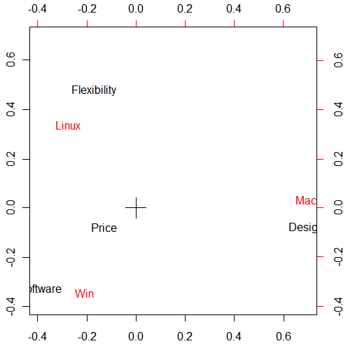
Now you can see the relationship of the data better. What this plot tells you is basically that the items located nearby are related. For instance, Software, Design, Flexibility are related to Windows, Mac, and Linux respectively. And Price is somewhat between Win and Linux. In that way, you can see what kind of impressions people have on each kind of OS.
Another way to run Correspondence Analysis is to use FactoMineR package. But you have to prepare the data with a dataframe.
Include the package, and run the analysis. With FactoMineR, the function name is CA() (both letters are capitalized).
You will get the same results, and CA() function also will show the same plot at the same time.
Multiple Correspondence Analysis Example
(I will add the content here later.)
R code example for Multiple Correspondence Analysis
(I will add the content here later.)