Table of Contents
Graphics in R
You can produce different kinds of graphs and visualizations in R (you can find creative examples here). However, I mostly use Excel to produce graphs because it is easier to use. But you may want to use some basic visualizations to examine the data. Here are some ways to create basic graphs in R. For histograms and Q-Q plots, please see a page for how to check the normality of data.
Bar plot
A bar plot (bar graph) is a most basic graph and it is probably your first choice when you want to visualize the means of different groups. Making a bar plot is easy in R. First, we prepare the data.
Then, we can run the command for drawing a bar plot.
names.arg is the list of the names for groups, col is the list of the colors to be used, and ylim is the range of the values on the y axis. There are many other options for barplot(), and you can check them by running ?barplot.

Although making a bar plot is easy, adding an error bar is not trivial. Here, we are adding the 95% confidence interval for each bar. Basically, you have to calculate where the errors should be drawn manually.
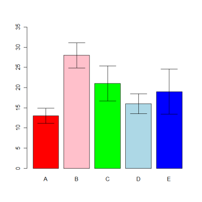
If you change the width of the bar, remember that you have to change the calculation of error_x.
Box plot
A box plot is a useful graph to know the distributions of different groups visually. Let's take a look at the example. First, we create data.
Then, you can create a box plot by doing linear regression or ANOVA.
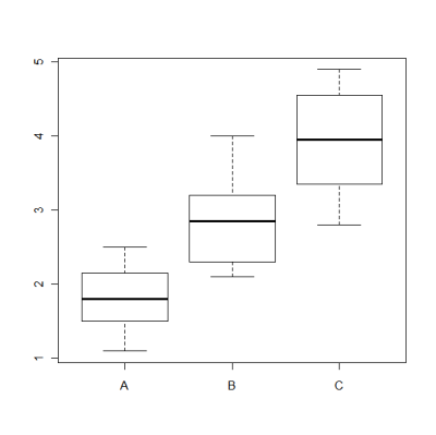
You need to know what are displayed in this graph.
- Bold line: The median (the point where 50% of the data occurs)
- Box: The range between the first quantile (the point where 25% of the data occurs) and third quantile (the point where 75% of the data occurs). This is also called IQR.
- Bottom bar: (The median - 1.5*IQR) or the minimum value, whichever the largest.
- Top bar: (The median + 1.5*IQR) or the maximum value, whichever the smallest.
So, in this example, Group B looks a little skewed, and Group A and C look evenly distributed (so probably close to the normal distribution).
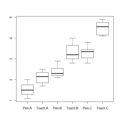
You can also specify multiple factors.
Multiple dot/line plot
If you have multiple groups of data over period (e.g., the number of experimental sessions), you want to draw a dot or line plot with multiple groups. And you can do it with matplot() in R. Here is an example of how to use matplot(). As usual, we first prepare the data.
Then, execute matplot().

type represents the kind of graphs you want to create. If you do type=“p”, it will be a dot plot. If you do type=“l”, it will be a line plot without points. pch means the character to be used for plotting. If you specify an integer, it will be a shape (e.g., a square, a triangle, or a circle). col means the color to be used for each group. There are other options for matplot(), and you can see the help by doing ?matplot.